
Facebook admits it poses mental health risk – but says using site more can help theguardian.com/technology/201…
Tagged: Twitter
I signed "A Letter About Google AMP" ampletter.org
↪ Replying to @andreasbard
@andreasbard Min fralla fick kämpa i 20 minuter till sin dagmatte. Men satan vad det blåste löv att jaga!
↪ Replying to @MsMiharo
@MsMiharo Blev nyfiken och googlade direkt "Fucking jävla kuk-Åmål" innan jag kom på att den inte hette så 😂
Having a pleasant face-to-face interaction with a stranger every morning is invigorating and energizing. Bus driver, barista, fellow passenger, dog owner, you name it. #lifegoals
I am happy that research like this exists. 🦇 x.com/wef/status/953…
How do you react when letters home from school contain 7-9 grammar and spelling mistakes?
↪ Replying to @classen_shannon
@classen_shannon Of course! Sharing is my game :)
@classen_shannon I’ve also uploaded the clip to Vimeo if that makes it easier for you to use in class: vimeo.com/251112183
↪ Replying to @FarukSpeaks
@KuraFire I agree with this sentiment (warning must align with severeness of outcome) although in a system like this it must be practically impossible to select the wrong option in the first place.
NEVER base a purchase decision on an alleged discount. x.com/walterstephani…
Incredibly important thread. More of us need to understand this aspect of being "frozen" when harassed or assaulted. It's called tonic immobility, or involuntary paralysis. x.com/eveewing/statu…
↪ Replying to @OrangeFact
@OrangeFact @MabandeOpenBeta You need to follow this bot that corrects people using the wrong flag. Love it. x.com/axbom/status/9…
↪ Replying to @PressSec45
@PressSec What does that even mean if the sentence doesn’t continue?
”I’d probably...” if what?
WSJ should have understood it was an incoherent sentence rather than a coherent one?
I’ve used this clip from Monsters vs Aliens in lectures about usability over the years. Never could I have imagined I would truly worry about the actual design of this, allegedly big, button as much as I currently do. Also, the Oprah reference is now uncanny...
It appears the operator in Hawaii had two options in a drop-down menu:
(1) Test missile alert
(2) Missile alert
In a drop-down there are no visual cues to guide the user, no size or color differences, no marked distance between click areas.
washingtonpost.com/news/post-nati…
The only difference in options is the word ”Test”. Both options may display, ”Are you sure?” but thinking you have selected the right one you will always select ”Yes/Continue”.
I have no idea about this dropdown but sometimes people inadvertently select an unintended option because mouse scroll wheels also scroll in dropdowns.
A dropdown may in fact be the worst possible design option for this type of interaction. Or to be more clear: devastatingly inappropriate.
Added to this: there was no way to easily cancel and undo the outgoing alert once the operator was aware of the mistake. No way to automatically send out a correction.
Ideally I would expect a call for UX/usability professionals to review computerized tools across the world, but alas I believe we will continue to see interface mistakes larger than this one.
I now hope Hawaii will be as transparent as possible about the chain of events, to create awareness and keep repeated mistakes of the same kind to a minimum in all countries.
Never before has the importance of positive friction in interfaces been so glaringly obvious.
I just published: The Usability of Buttons that Harm or Save Lives
medium.com/@axbom/the-usa…
OMFG. This appears to be the interface that was at fault for the ballistic missile alarm on Hawaii. It is way way worse than I possibly could have conjured up in my wildest dreams.
x.com/CivilBeat/stat…
So in my article yesterday I referenced WarGames (the movie), but I did not see this image coming... #hawaii
» Yesterday's article: medium.com/misusability/t…
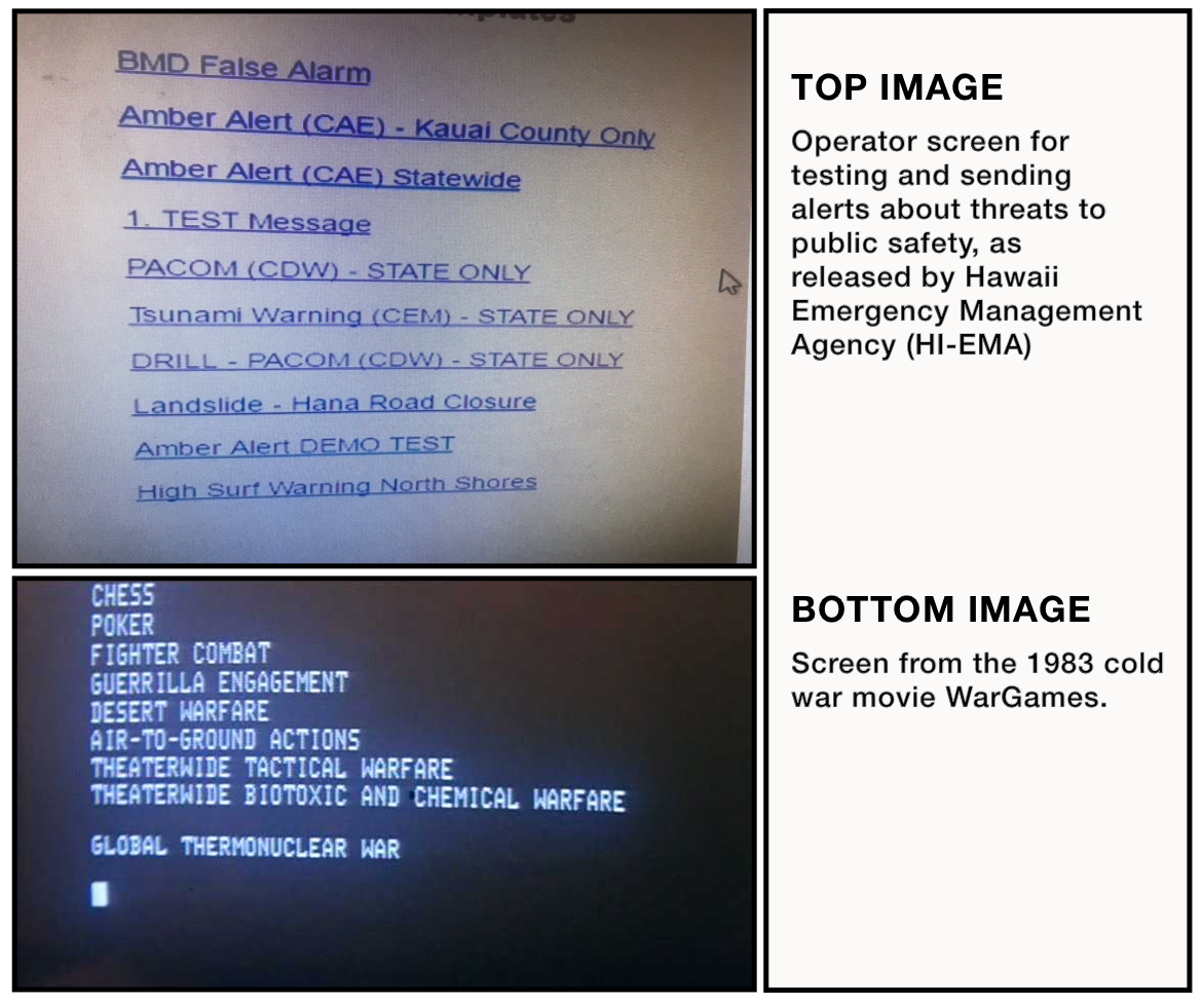
You can now get a feel for the interface (The mockup interaction is purely based on imagination and lack of time - any similarities with the actual interaction design, beyond what is in the screenshot, is purely coincidental).
udo.se/hawaii/ #hawaii
Just now realized why the number ”1” is there. In a fit of desperation the users tried to see if they could sort the links by numbering the template names...
Stop the presses! This also is not the correct interface... civilbeat.org/2018/01/hawaii… via @andysternberg #hawaii
Been coming across some ”design suggestions” for the Emergency Warning Messaging interface... some of them are really not showing the profession in good light. 😬 Or I just don’t know what a joke is anymore. 🤪
I think we can agree that spending a few hours ”throwing something together” is how problems arise. Whatever the chain of events leading to the incident, problems are systemic and bigger and broader than a single interface.
Read @jmspool’s take on the likely setup that contributed to the false ballistic missile alert: filenames. medium.com/ux-immersion-i… #hawaii
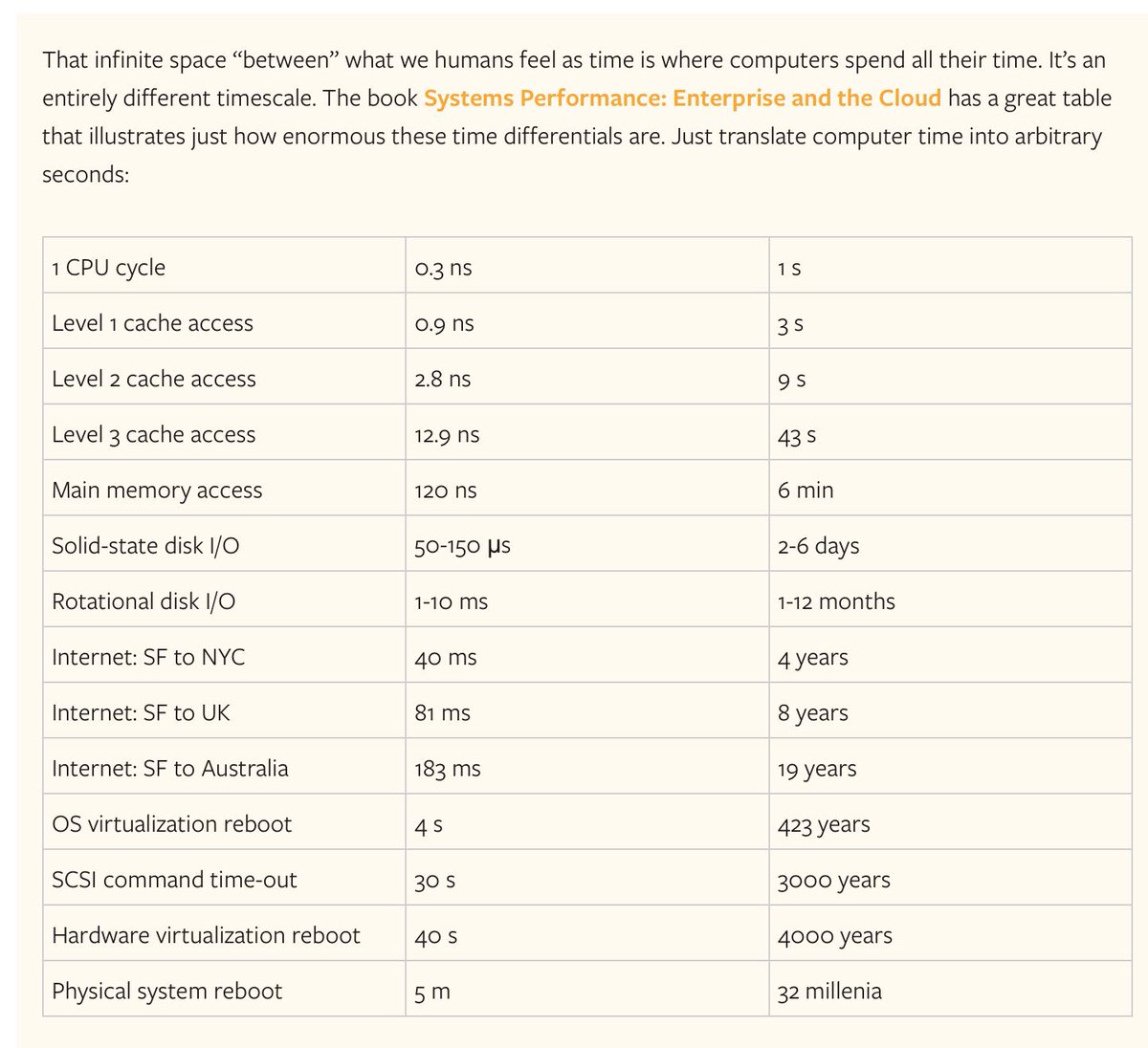
Love this table to help us understand the scale of time in which a computer operates. Found via the article Meltdown, Spectre and the State of Technology: stratechery.com/2018/meltdown-…
↪ Replying to @TexasLiberty15
@TexasLiberty15 Agree, not required but very likely. Here’s the same physician on Obama: obamawhitehouse.archives.gov/sites/default/…
A doctor would also sign ”Ronny Jackson, MD”, not ”Dr. Ronny Jackson.” But whatevs, this seems to be actual reality now. The president faking a note to get out of gym class. x.com/maddowblog/sta…