
I’ve used this clip from Monsters vs Aliens in lectures about usability over the years. Never could I have imagined I would truly worry about the actual design of this, allegedly big, button as much as I currently do. Also, the Oprah reference is now uncanny...
It appears the operator in Hawaii had two options in a drop-down menu:
(1) Test missile alert
(2) Missile alert
In a drop-down there are no visual cues to guide the user, no size or color differences, no marked distance between click areas.
washingtonpost.com/news/post-nati…
The only difference in options is the word ”Test”. Both options may display, ”Are you sure?” but thinking you have selected the right one you will always select ”Yes/Continue”.
I have no idea about this dropdown but sometimes people inadvertently select an unintended option because mouse scroll wheels also scroll in dropdowns.
A dropdown may in fact be the worst possible design option for this type of interaction. Or to be more clear: devastatingly inappropriate.
Added to this: there was no way to easily cancel and undo the outgoing alert once the operator was aware of the mistake. No way to automatically send out a correction.
Ideally I would expect a call for UX/usability professionals to review computerized tools across the world, but alas I believe we will continue to see interface mistakes larger than this one.
I now hope Hawaii will be as transparent as possible about the chain of events, to create awareness and keep repeated mistakes of the same kind to a minimum in all countries.
Never before has the importance of positive friction in interfaces been so glaringly obvious.
I just published: The Usability of Buttons that Harm or Save Lives
medium.com/@axbom/the-usa…
OMFG. This appears to be the interface that was at fault for the ballistic missile alarm on Hawaii. It is way way worse than I possibly could have conjured up in my wildest dreams.
x.com/CivilBeat/stat…
So in my article yesterday I referenced WarGames (the movie), but I did not see this image coming... #hawaii
» Yesterday's article: medium.com/misusability/t…
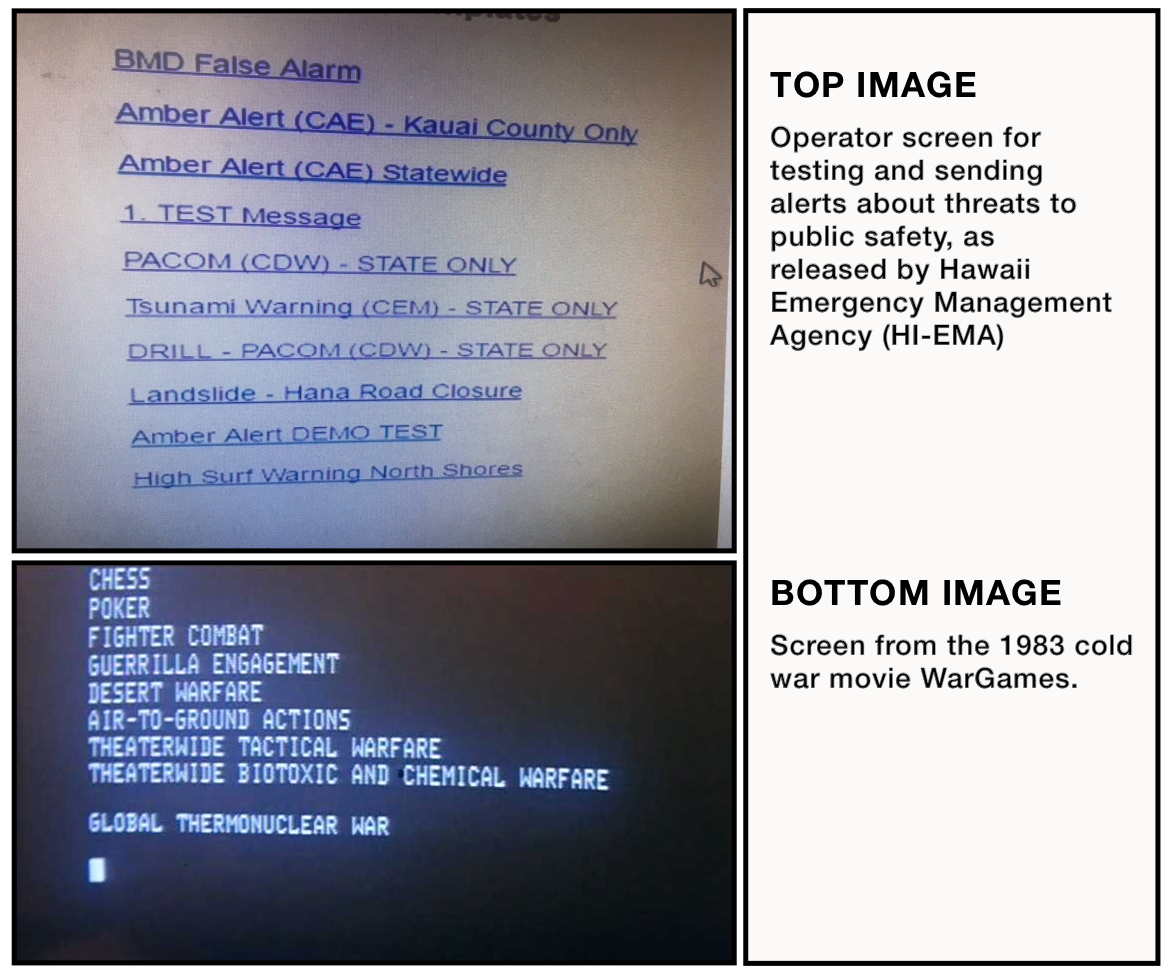
You can now get a feel for the interface (The mockup interaction is purely based on imagination and lack of time - any similarities with the actual interaction design, beyond what is in the screenshot, is purely coincidental).
udo.se/hawaii/ #hawaii
Just now realized why the number ”1” is there. In a fit of desperation the users tried to see if they could sort the links by numbering the template names...
Stop the presses! This also is not the correct interface... civilbeat.org/2018/01/hawaii… via @andysternberg #hawaii
Been coming across some ”design suggestions” for the Emergency Warning Messaging interface... some of them are really not showing the profession in good light. 😬 Or I just don’t know what a joke is anymore. 🤪
I think we can agree that spending a few hours ”throwing something together” is how problems arise. Whatever the chain of events leading to the incident, problems are systemic and bigger and broader than a single interface.
Read @jmspool’s take on the likely setup that contributed to the false ballistic missile alert: filenames. medium.com/ux-immersion-i… #hawaii