Skip to content
Notes by Axbom
Per Axbom Akkoma

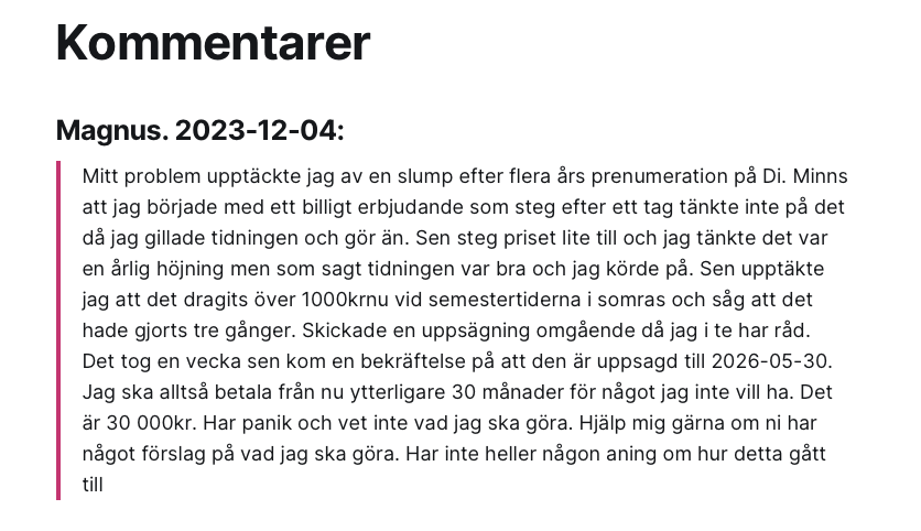
Tänk att bli inlåst i kostnader på 30.000 kronor. Det sticker i ögonen på mig när Dagens industri går ut och skryter om att det ökat mängden prenumeranter. Jag får fortfarande mejl, fyra år senare, från människor som i ren och skär panik vill ha hjälp att komma ur dyra Di-prenumerationer. Eller bara vill berätta vilka häpnadsväckande inlåsningar de fastnat i, som denna kommentar på min blogg från 4 december (jag har fixat några korrfel men original-texten syns i bilden):

Magnus. 2023-12-04:
"Mitt problem upptäckte jag av en slump efter flera års prenumeration på Di. Minns att jag började med ett billigt erbjudande som steg efter ett tag tänkte inte på det då jag gillade tidningen och gör än. Sen steg priset lite till och jag tänkte det var en årlig höjning men som sagt tidningen var bra och jag körde på. Sen upptäckte jag att det dragits över 1000kr nu vid semestertiderna i somras och såg att det hade gjorts tre gånger. Skickade en uppsägning omgående då jag inte har råd. Det tog en vecka sen kom en bekräftelse på att den är uppsagd till 2026-05-30. Jag ska alltså betala från nu ytterligare 30 månader för något jag inte vill ha. Det är 30 000kr. Har panik och vet inte vad jag ska göra. Hjälp mig gärna om ni har något förslag på vad jag ska göra. Har inte heller någon aning om hur detta gått till."

20 februari 2020 skrev jag mitt första inlägg om Dagens industri. Det är där kommentarer fortsätter komma, eller direktmejl till mig.
https://axbom.se/dagensindustri/

Den 13 februari 2023 figurerade min kritik i ett inslag av Plånboken i P1 då Di kritiserats av Konsumentverket:
https://axbom.se/dagens-industri-konsumentverket/

Den korta versionen av historien med Konsumentverket är att de bad DI att förklara varför de fått in så många anmälningar gällande Vilseledande marknadsföring och Oskäliga avtalsvillkor. DI svarade med en krystad förklaring som gäller en text som fallit bort i bekräftelsemejlet (som om avtal inte ingås innan bekräftelsen skickas). Konsumentverket nöjer sig med det och avslutar med andemeningen "okej men gör inte om det för vi håller ögonen på er".

Men jag undrar om det är någon som håller ögonen på Di? Inga andra dagstidningar i alla fall.

Om du vill berätta om dina erfarenheter så är du välkommen att höra av dig till mig, anonymt via Signal eller mejl. Men jag råder dig också att anmäla till Konsumentverket.

Konsumentvägledare Gabriel Södersten säger så här i Plånboken-inslaget:

"Jag skulle säga att den här typen av… sättet att binda upp konsumenter på, det är ju det vi brukar se i rådgivningen kring sådana här företag som sysslar med abonnemangsfällor nästan då, att man: 'nä men här är ett prova-på-paket i tre månader' och så står det i det finstilta 'du blir samtidigt bunden i ett år' och måste betala fyra tusen kronor till.

Så att det är ju den här typen av tillvägagångssätt det är ju inte riktigt kanske det man brukar förknippa med en stor, seriös, svensk dagstidning utan med lite mer obskyra bolag skulle jag säga."
Magnus. 2023-12-04:

🔗 Originally posted on Akkoma

22 Jan 2024, 09:50
Share
LinkedIn Bluesky Email
Per Axbom LinkedIn

Tänk att bli inlåst i kostnader på 30.000 kronor. Det sticker i ögonen på mig när Dagens industri går ut och skryter om att de ökat antalet prenumeranter. Jag får fortfarande mejl, fyra år senare, från människor som i ren och skär panik vill ha hjälp att komma ur dyra Di-prenumerationer. Eller bara vill berätta vilka häpnadsväckande inlåsningar de fastnat i, som denna kommentar på min blogg från 4 december (jag har fixat några korrfel men original-texten syns i bilden):

Magnus. 2023-12-04:

"Mitt problem upptäckte jag av en slump efter flera års prenumeration på Di. Minns att jag började med ett billigt erbjudande som steg efter ett tag tänkte inte på det då jag gillade tidningen och gör än. Sen steg priset lite till och jag tänkte det var en årlig höjning men som sagt tidningen var bra och jag körde på. Sen upptäckte jag att det dragits över 1000kr nu vid semestertiderna i somras och såg att det hade gjorts tre gånger. Skickade en uppsägning omgående då jag inte har råd. Det tog en vecka sen kom en bekräftelse på att den är uppsagd till 2026-05-30. Jag ska alltså betala från nu ytterligare 30 månader för något jag inte vill ha. Det är 30 000kr. Har panik och vet inte vad jag ska göra. Hjälp mig gärna om ni har något förslag på vad jag ska göra. Har inte heller någon aning om hur detta gått till."

20 februari 2020 skrev jag mitt första inlägg om Dagens industri. Det är där kommentarer fortsätter komma, eller direktmejl till mig.

https://axbom.se/dagensindustri/

Den 13 februari 2023 figurerade min kritik i ett inslag av Plånboken i P1 då Di kritiserats av Konsumentverket:

https://axbom.se/dagens-industri-konsumentverket/

Den korta versionen av historien med Konsumentverket är att de bad DI att förklara varför de fått in så många anmälningar gällande Vilseledande marknadsföring och Oskäliga avtalsvillkor. DI svarade med en krystad förklaring som gäller en text som fallit bort i bekräftelsemejlet (som om avtal inte ingås innan bekräftelsen skickas). Konsumentverket nöjer sig med det och avslutar med andemeningen "okej men gör inte om det för vi håller ögonen på er".

Men jag undrar om det är någon som håller ögonen på Di? Inga andra dagstidningar i alla fall.

Om du vill berätta om dina erfarenheter så är du välkommen att höra av dig till mig, anonymt via Signal eller mejl. Men jag råder dig också att anmäla till Konsumentverket.

Konsumentvägledare Gabriel Södersten säger så här i Plånboken-inslaget:

"Jag skulle säga att den här typen av… sättet att binda upp konsumenter på, det är ju det vi brukar se i rådgivningen kring sådana här företag som sysslar med abonnemangsfällor nästan då, att man: 'nä men här är ett prova-på-paket i tre månader' och så står det i det finstilta 'du blir samtidigt bunden i ett år' och måste betala fyra tusen kronor till.

Så att det är ju den här typen av tillvägagångssätt det är ju inte riktigt kanske det man brukar förknippa med en stor, seriös, svensk dagstidning utan med lite mer obskyra bolag skulle jag säga."

🔗 Originally posted on LinkedIn

22 Jan 2024, 09:42
Share
LinkedIn Bluesky Email
Per Axbom Akkoma

ÖVERSKOTTSBEFÄL.

Det sägs man ska vara företagssam
men kan en ÖB vara företagsman
med en sådan sträng av lapsus på sin lyra
att han i varje ämne får bedyra
en drivkraft mer än bara företagsgagn?

🔗 Originally posted on Akkoma

20 Jan 2024, 09:42
Share
LinkedIn Bluesky Email
Per Axbom LinkedIn

ÖVERSKOTTSBEFÄL.

Det sägs man ska vara företagssam

men kan en ÖB vara företagsman

med en sådan sträng av lapsus på sin lyra

att han i varje ämne får bedyra

en drivkraft mer än bara företagsgagn?

/ Följ mig för veckans nyheter i limerick-format. 😁

🔗 Originally posted on LinkedIn

20 Jan 2024, 09:37
Share
LinkedIn Bluesky Email
Per Axbom Akkoma reply

@stephenpa @scottjenson

I've _just_ switched to a self-hosted version of cal.com

🔗 Originally posted on Akkoma

20 Jan 2024, 07:43
Share
LinkedIn Bluesky Email
Per Axbom LinkedIn

Love seeing my diagrams and infographics in the wild. I’m so happy they are found to be useful. ❤️

🔗 Originally posted on LinkedIn

19 Jan 2024, 10:05
Share
LinkedIn Bluesky Email
Per Axbom LinkedIn

”Företagen vet att det finns ett tillitsproblem, men det betyder bara att de kommer anstränga sig för att få oss att känna tillit. Det är inte samma sak som att minska riskerna med tekniken.” – Marietje Schaake, forskare vid Stanforduniversitetet

🔗 Originally posted on LinkedIn

19 Jan 2024, 10:02
Share
LinkedIn Bluesky Email
Per Axbom Akkoma reply

@nafnlaus The decision to design them this way is purely human. There are a multitude of human decisions even in unsupervised "learning", when it comes to labelling and modelling. The fact that many of these algorithms are a black box when it comes to predictability is only an example of humans building an error-prone system based on human material.

The machine is also an extension of all human error contained in the unsupervised training material, including historical and representation bias. It's further adding more human input to the mix, not less. All that human labor fed into the machine, and none of those humans visible. Again, it's hard to see the humans (who produced all that content) because of the machines.

Unsupervised training is for example also how Child Sexual Abuse Material has made its way into image generators, and descriptions of abuse and violence into all the text generators. There are people working around the clock across the world to prevent this content from appearing in generated content. More invisible humans doing invisible labor.

I agree they aren't puppets, although puppet features exist in AI as well (deepfake generators). But they are truly not a separate entity from human influence and decision-making. The way I see it, it's all they are. And sometimes that leads to exacerbating human bias rather than minimising it.

🔗 Originally posted on Akkoma

18 Jan 2024, 11:41
Share
LinkedIn Bluesky Email
Per Axbom Akkoma

Fascinated by the rebuttal that humans make mistakes too, so algorithms should be allowed to as well.

As if the machine is disconnected from the humans building, deploying and using them.

The machines are an extension of human mistakes, not its own separate entity with free will.

It would appear, ironically, that when a huge number of humans are involved in building the machines, the humans become invisible.

Future historians:
"They couldn't see the humans because of all the machines."

#AIEthics #DigitalEthics

🔗 Originally posted on Akkoma

18 Jan 2024, 10:43
Share
LinkedIn Bluesky Email
Per Axbom Bluesky

"From the generic hipster cafe to the ‘Instagram wall’, the internet has pushed us towards a kind of global ubiquity – and this phenomenon is only going to intensify"

www.theguardian.com/news/2024/ja...

The tyranny of the algorithm: why every coffee shop looks the same

🔗 Originally posted on Bluesky

18 Jan 2024, 10:34
Share
LinkedIn Bluesky Email
Per Axbom LinkedIn

Är jag överdrivet petig när jag reagerar på att ett företag som bedriver kompetensutveckling och utbildning kör en annons i flera veckor som innehåller stavfel?

Annonsen har två korta textstycken och bägge innehåller ett stavfel (eller grammatik-fel beroende på hur man ser det).

Jag tänker att om jag retar mig på detta så gör fler det. Det är förvånansvärt ofta den här typen av fel dyker upp i texter som borde ha granskats av många personer.

Det finns såväl yrkespersoner som tekniska verktyg som kan hjälpa. Men hjälpen uteblir.

Jag blir lite häpen var gång jag ser sån't här. Men det är klart, det drabbar ju mest mig själv. Jag får gå en promenad och fundera över varför jag bryr mig så mycket. 😁

🔗 Originally posted on LinkedIn

18 Jan 2024, 09:15
Share
LinkedIn Bluesky Email
Per Axbom Akkoma reply

@Caution

This makes me so happy 😊 Thank you for letting me know.

@JMMaok

@Caution @JMMaok

I couldn't resist making a real demo in jsbin:

https://output.jsbin.com/gapapox/

🔗 Originally posted on Akkoma

17 Jan 2024, 10:02
Share
LinkedIn Bluesky Email
Per Axbom Akkoma reply

@JMMaok

While I don’t get a chance to code myself as much anymore, the recommendation would be to not style headings but instead apply class names for the visual appearance. Hence one would separate semantic hierarchy (h1…h6) from look-and-feel.

For instance:

<style>
.TitleXL {font-size: 2em}
.TitleL {font-size: 1.8em}
.TitleM {font-size: 1.4em}
.TitleS {font-size: 1.2em}
</style>

In my example then it would be.

<h1 class=“TitleXL”>Site Name</h1>
<h2 class=“TitleL”>Article 1</h2>
<h2 class=“TitleM”>Article 2</h2>
<h2 class=“TitleM”>Article 3</h2>
<h2 class=“TitleS”>Social media</h2>
<h2 class=“TitleS”>Resources</h2>
<h2 class=“TitleS”>Abous us</h2>
<h2 class=“TitleS”>Contact info</h2>

To complicate things, if I was building this page I would likely add a separate heading for the whole footer area. That heading would then be h2 and the four columns would each have an h3. But it was a quick example 😉

🔗 Originally posted on Akkoma

16 Jan 2024, 23:41
Share
LinkedIn Bluesky Email
Per Axbom Akkoma reply

@JMMaok

If that is your only visual clue I would agree, but I would presume that there are other design features that indicate how a heading or title is related to the content it refers to.

I made a quick sketch to explain.

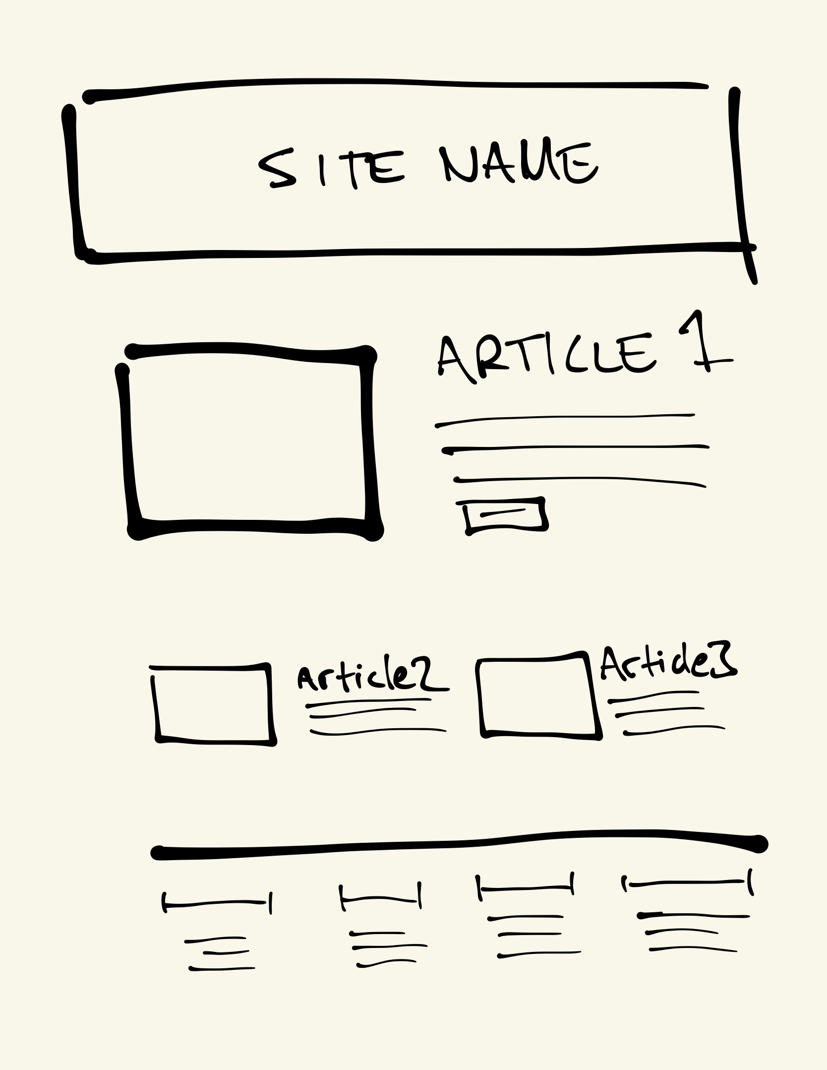
In the attached sketch there are three articles but one is displayed as a featured article and the title of that article is visually displayed in a larger font.

If in this case the site title is chosen to be h1 then each of those three article titles would be h2, regardless of their visual size on screen. From the design, it is clear which content element each article refers to.

Moving on to the footer of the site, I have drawn 4 sections, or columns, with 3 links each. The heading of each of those sections is visually smaller than any of the article titles. But in this specific example they would be h2 headings as well, or the hierarchical structure would be off. If in the code they were h3 or h4, they would be interpreted as belonging to article 3, as they would then be subheadings under that article.

But I doubt that anyone looking at this page would interpret the footer headings to be subheadings of article 3, even if they are smaller than that heading. Similarly, the two articles in the center of the page are not easily interpreted as being part of article 1, even if the title fonts of article 2 and article 3 are smaller. The overall visual cues tell the whole story. The code should tell the same story.

Simple hand-drawn sketch of a website.  

A wide box at the top is labelled with a text in the center saying SITE NAME. The box spans the full width of the content area.

Below that is a box indicating an image, alongside a title written as ARTICLE 1 and lines to symbolize written content. Together the box and ARTICLE 1 span the full width of the content area.

Below the ARTICLE 1 area are two columns, each with an image and article title, Article 2 and Article 3. These are similar in design to ARTICLE 1 but smaller in size.

Finally there is a footer area spanning the width of the page with four columns of content, each with its own title/heading and three lines of content.

🔗 Originally posted on Akkoma

16 Jan 2024, 23:00
Share
LinkedIn Bluesky Email
Per Axbom Akkoma reply

@SuperTaliaDX

It’s a fair question. It functionally makes a difference primarily within 1) accessibility and 2) machine interpretation.

In the case of accessibility, the correct heading hierarchy makes it easier to navigate content and understand how different parts of a page relate to each other. With missing or misplaced headings the content becomes more confusing to read with a screen reader*. Jumping between, and listing, the headings of a page are common ways of navigating.

Similary, if machine interpretation is used to determine for example main, supporting and related content it can help pull relevant content to respond to questions and infer importance of one piece of content over another.

One very simple and common example would be an automated table of contents to jump to different sections of a page.

*(The use of a screen reader is of course also an example of machine interpretation)

🔗 Originally posted on Akkoma

16 Jan 2024, 22:24
Share
LinkedIn Bluesky Email
Per Axbom LinkedIn

I interrupt my regular programming to just remind everyone that there is such a thing as h1…h6 headings in html but they are supposed to be used for communicating structure of a page, not visual size.

An h2-heading in one part of your page or site does not have to be the same size as an h2-heading in another part or your page or site. The purpose of the heading is to semantically communicate hierarchy.

In fact, deciding that all h2 headings must be the same size across your website will usually lead to poor decisions with regards to the underlying structure of your page.

What does your design system say about the size of h1…h6?

So yes, the heading in your footer should likely be an h2 but it doesn’t have to be the same size as the h2 in an article. And no you shouldn’t make it an h4 ”because I want it smaller”!

This may be one of the most misunderstood elements of web design.

P.S. And yes you are allowed to have more than one h1 on a page. Yes, really.

#mythbusting

🔗 Originally posted on LinkedIn

16 Jan 2024, 12:44
Share
LinkedIn Bluesky Email
Per Axbom Akkoma reply

@evilcookies98

h1 is generally the title of the page OR the title of the main article.
h2 will be subheadings
h3 will be subheadings to h2 sections

So you may not be doing it wrong?

What people tend to get wrong is the idea that they can not add h2 below h4. That just means that you are starting a new topic, which is fine. I also see people using h4 in for headings in sidebars (that are about something else than the main article) because they want a smaller font. But since they are new topics, they should often be h2, for example.

So, generally, like this is how one should think (example from the W3C page:

<h1>Plant foods</h1>
<h2>Fruit</h2>
<h3>Apple</h3>
<h3>Banana</h3>
<h2>Vegetables</h2>
<h3>Broccoli</h3>
<h3>Green breans</h3>
<h2>Related articles</h2>

Since this is the internet, someone will soon inform me that bananas are botanically berries. 😊

W3C on headings: https://www.w3.org/TR/WCAG20-TECHS/H42

There has long been a debate about whether you can have multiple h1's on a page, and generally, yes, I would argue that you can. Which Matt Cutts from Google also confirmed 15 years ago:
https://www.youtube.com/watch?v=GIn5qJKU8VM

🔗 Originally posted on Akkoma

16 Jan 2024, 11:38
Share
LinkedIn Bluesky Email
Per Axbom Akkoma

Let me say it louder for the people in the back… heading levels (h1, h2, h3…) in html are not about size, they are about structure. They communicate the organization of your page.

An h2-heading in one part of your page or site does not have to be the same size as an h2-heading in another part or your page or site. The purpose of the heading is to semantically communicate hierarchy.

In fact, deciding that all h2 headings must be the same size across your website will usually lead to poor decisions with regards to the underlying structure of your page.

So yes, the heading in your footer should likely be an h2 but it doesn’t have to be the same size as the h2 in an article. And no you shouldn’t make it an h4 ”because I want it smaller”!

This may be one of the most misunderstood elements of web design.

#WebDesign

🔗 Originally posted on Akkoma

15 Jan 2024, 19:16
Share
LinkedIn Bluesky Email
Per Axbom LinkedIn

"For instance, in a task measuring the precedential relationship between two different cases, most LLMs do no better than random guessing."

🔗 Originally posted on LinkedIn

13 Jan 2024, 21:53
Share
LinkedIn Bluesky Email
Per Axbom Akkoma reply

@samuel

En Ghost-installation per domän. Men du kan ha flera författare per installation. Då får varje författare en sådan här sida med alla sina inlägg:

https://axbom.se/author/axbom/

Eftersom jag använder Cloudron kan jag starta en ny Ghost-installation med ett klick.

Så t ex https://digitill.se och https://dataskuggan.se är två av mina sajter också. För elever har jag en med inloggning: https://etik.axbom.se/ och ibland planerar jag bokskrivande på det sättet också: https://debook.axbom.com/

@fiaewald @konstellationen

🔗 Originally posted on Akkoma

12 Jan 2024, 17:43
Share
LinkedIn Bluesky Email
← Newer Older →
  • Notes by Axbom
  • RSS

© 2026 Notes by Axbom