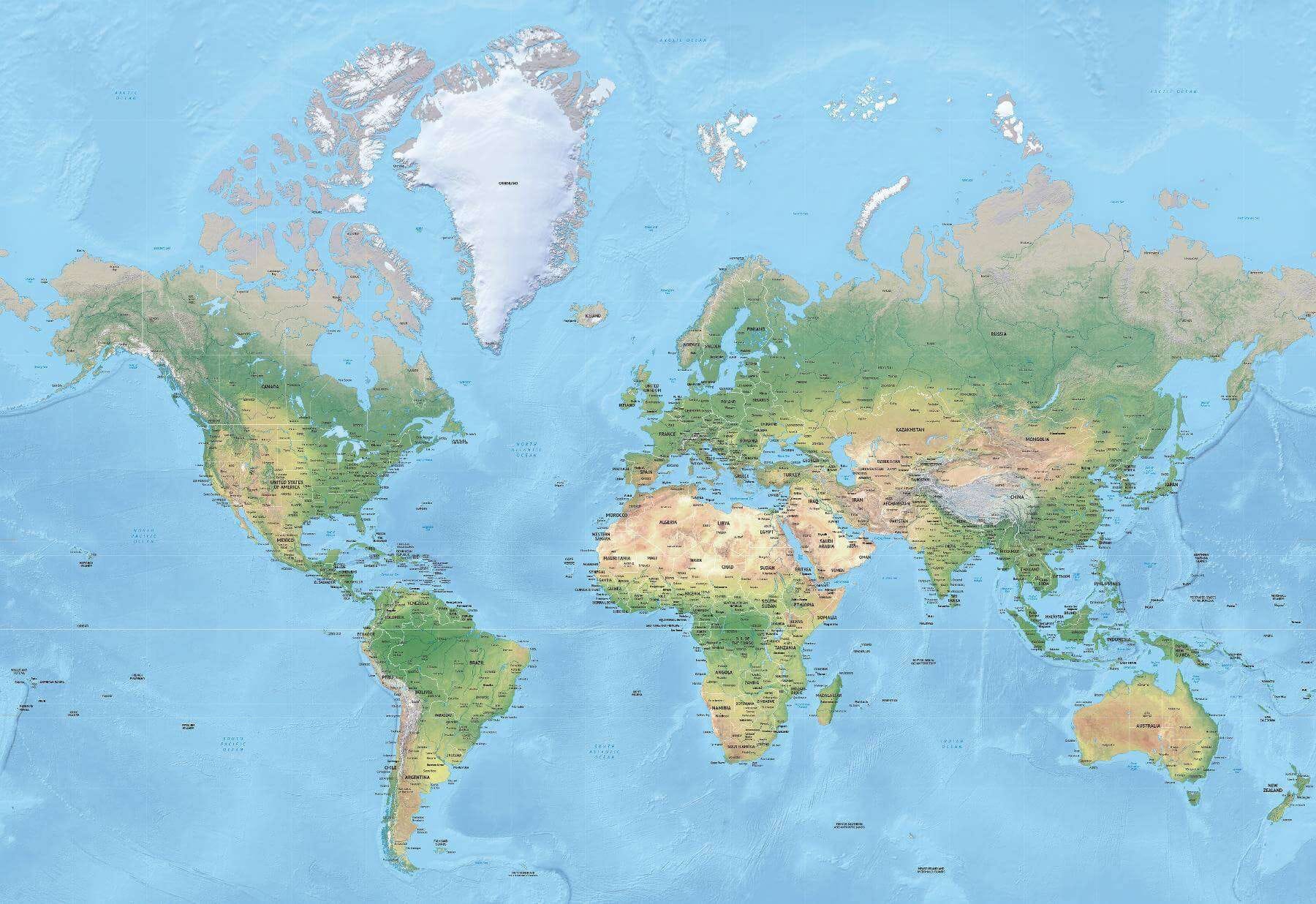
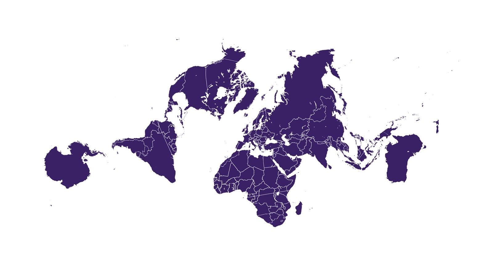
Nice. Greenland is quite large in most of these but I really like the Mollweide one. It doesn’t sway too much from what people are used to, reminds us that the world is not a rectangle, and puts the equator where it should be 😁
I feel certain I was able to in the past build a template that pulled the content from an existing published page (not post) and could output the content inside the template.
But now I can't find any example code that matches this use-case. And the site I remember doing this on has been retired.
Anybody have any idea? I'm thinking something along the lines of
It’s easy to mock the people who believe the Earth is flat. It’s harder to accept how one's own world view is largely based on a flat representation of the planet.
Most flat maps, by their very nature, grossly misrepresent the size of countries and contribute to confusion.
The flat, visual portrayal of the world in two dimensions based on the Mercator projection has been so commonplace in ‘Western' classrooms that this map is widely embedded in collective consciousness as a plausible truth.
In my experience too few are taught to question it.
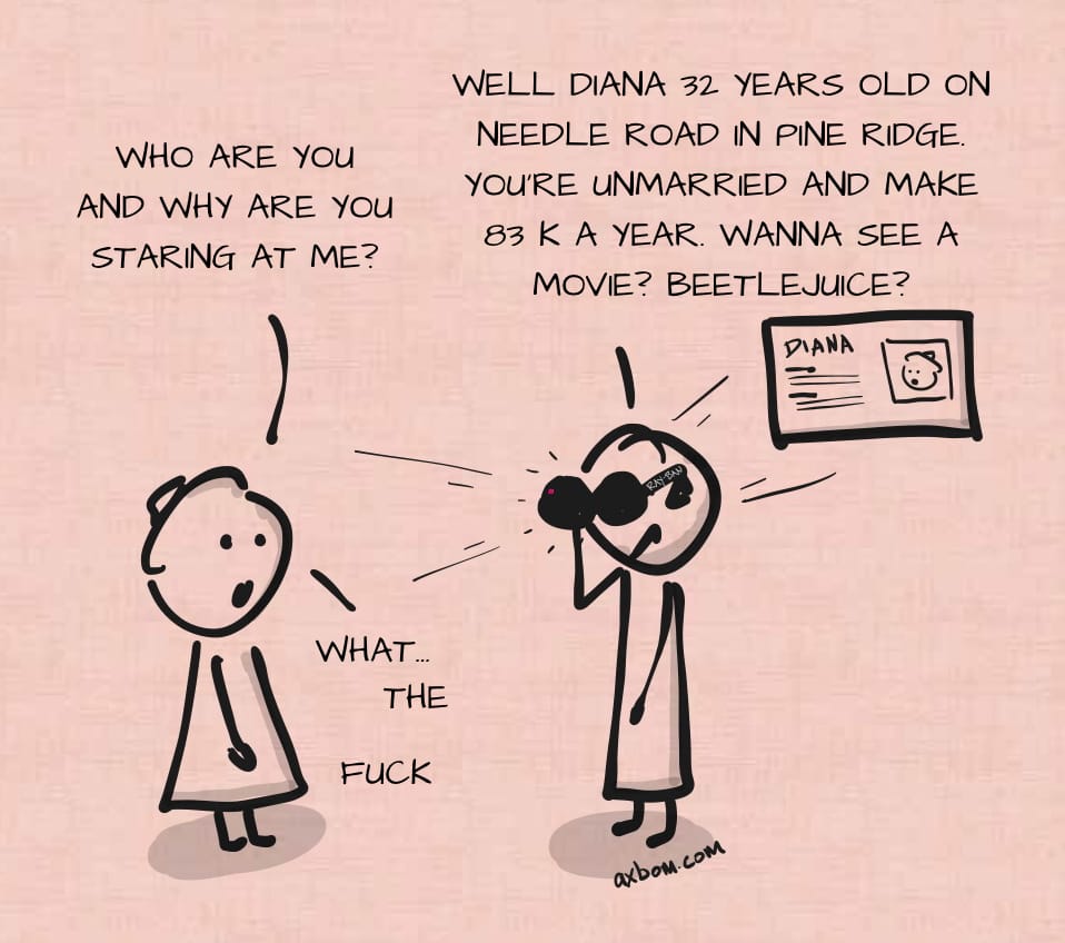
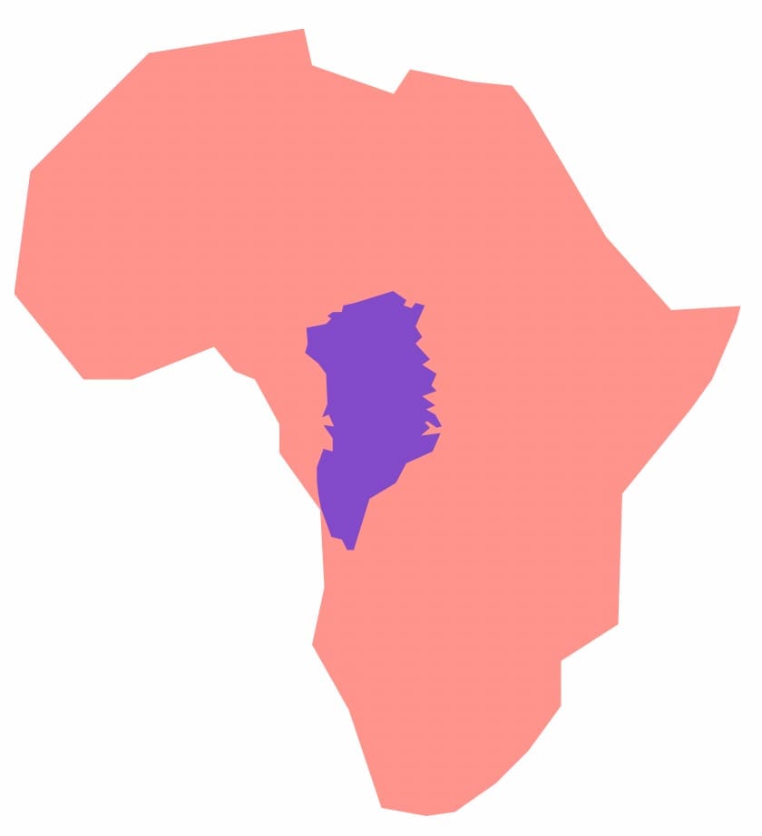
In your head you may use this map to think about distances between countries, and the shapes and sizes of countries and continents. Greenland and Africa, for example, look to be essentially the same size.
In reality of course Africa is about 14 times larger than Greenland.
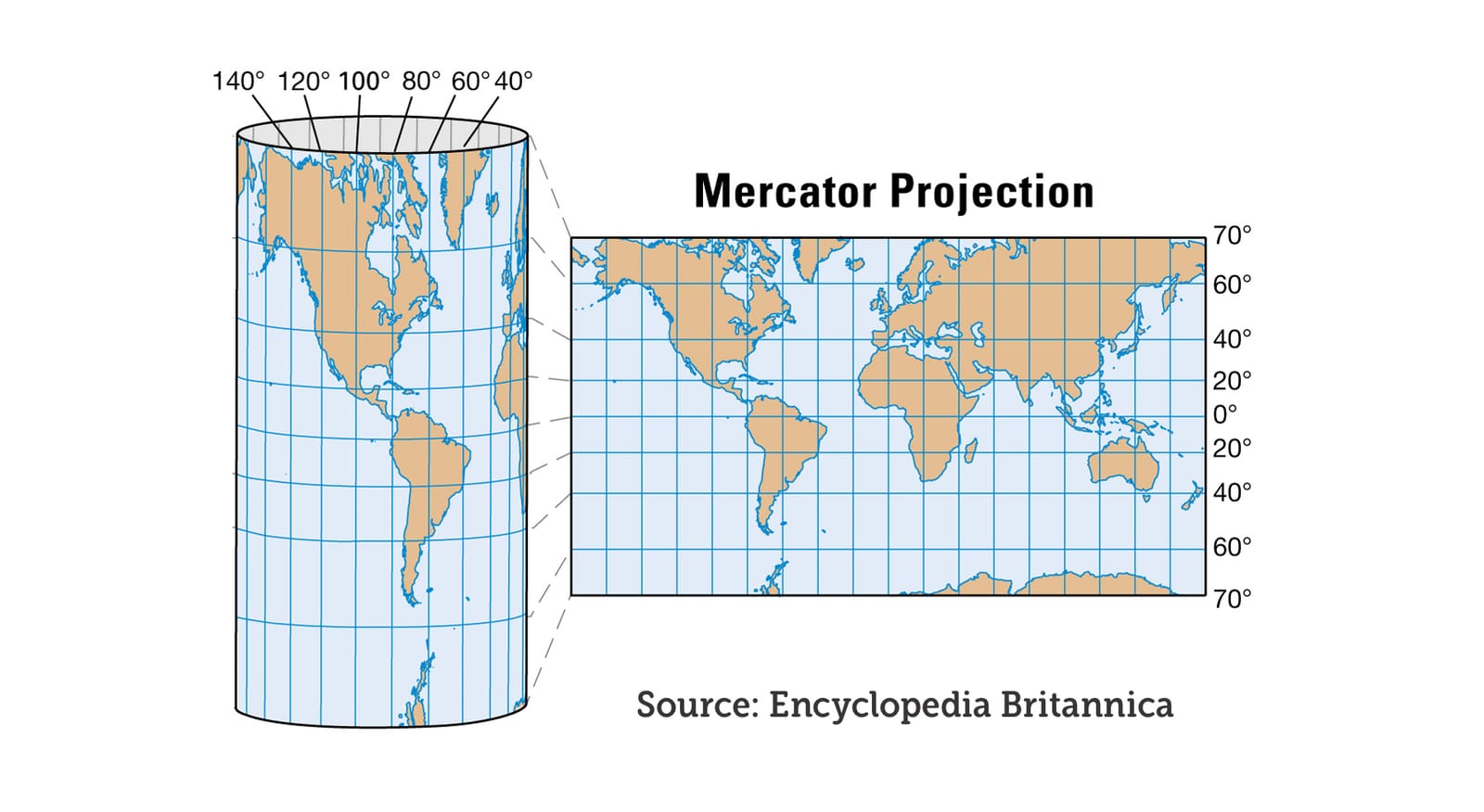
What is happening in the Mercator projection is that the further something is from the equator, the bigger it appears, because it is necessarily stretched out horizontally.
A world map based on the Mercator projection is constructed as if the world was a cylinder rather than a globe.
There is another non-intuitive effect of flattening the globe in this way. It's about how the curvature of the Earth is misrepresented.
When drawing straight lines between countries they would in reality be curved and seemingly curved lines can in fact be mostly straight.
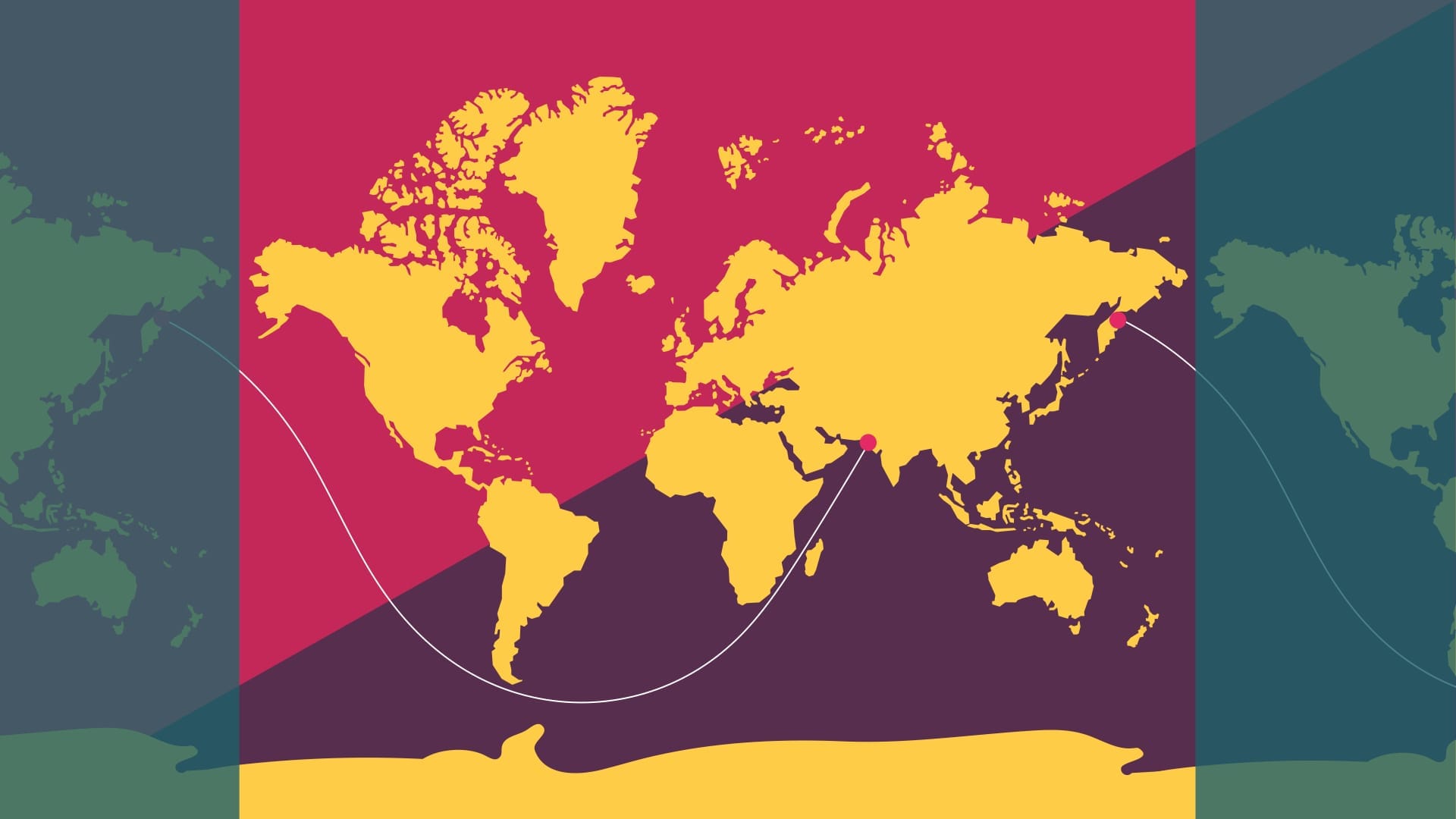
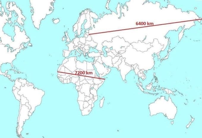
What is this line?
This line represents the longest distance you can sail across the world in a straight line without hitting land. It represents a distance of 32,000 kilometres.
And yes, you read that right: this is a straight line (or, you know, a straight-direction line).
When people refuse to believe me, I show this video with a 3D representation of the globe using Google Earth. Here it becomes evident that the line is in fact straight (along the curvature of the Earth).
As a further example of the skewed perspective provided by the Mercator projection, in this video I’m using the service thetruesize.com to show how Kenya, a country on the equator, would appear if it was further north or south on the map.
Another favorite example of mine is Sweden compared to Madagascar. On a world map based on the Mercator projection Sweden appears to be at least twice the size of Madagascar. In reality, Madagascar is 30% larger than Sweden.
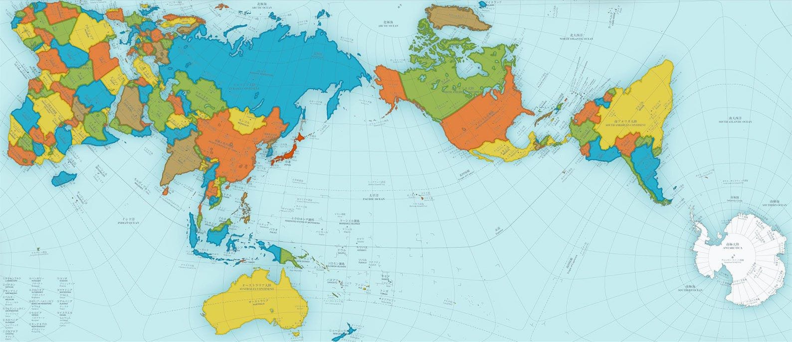
There are of course many different flat projections other than Mercator. Before I reveal them all, have a look at the Authagraph projection, invented in 1999 by Japanese architect Hajime Narukawa, earning him the Good Design Award in 2016.
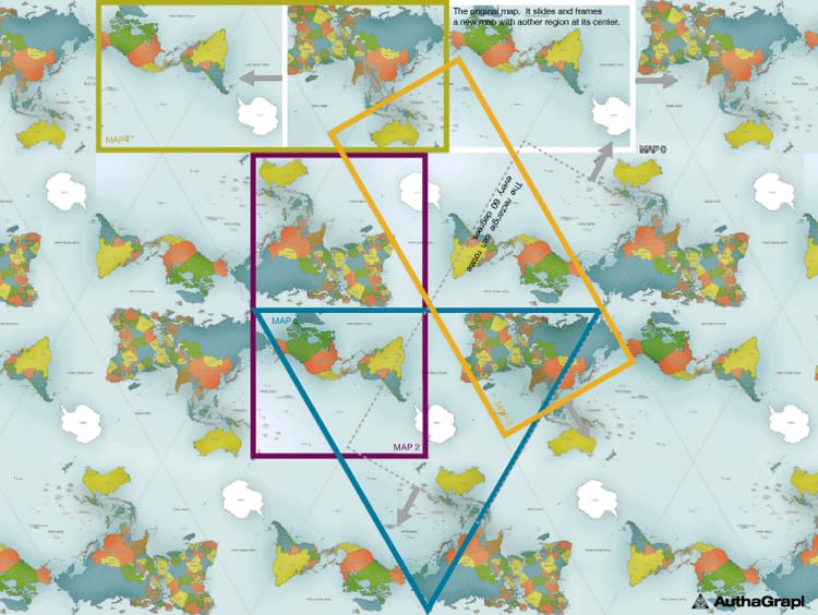
Authagraph does a much better job at preserving the relative size and area of land and water masses, while reducing shape distortion. It is also designed to avoid dead ends, allowing the spherical nature of the world to be visualised by simply expanding the map in any direction.
You can choose, and are encouraged to, center the Authagraph map on any part of the world to ensure that your perspective is relevant to what you are trying to learn. Here, centered on Europe. Do you recognize your part of the world? Any aha moments?
So what did I learn from looking at maps and how they distort our understanding of the planet? I of course shared some insights in my comprehensive blog post.
axbom.com/world-map/
You can dive in there, or if you want more mind-boggling examples, I’m here for you.
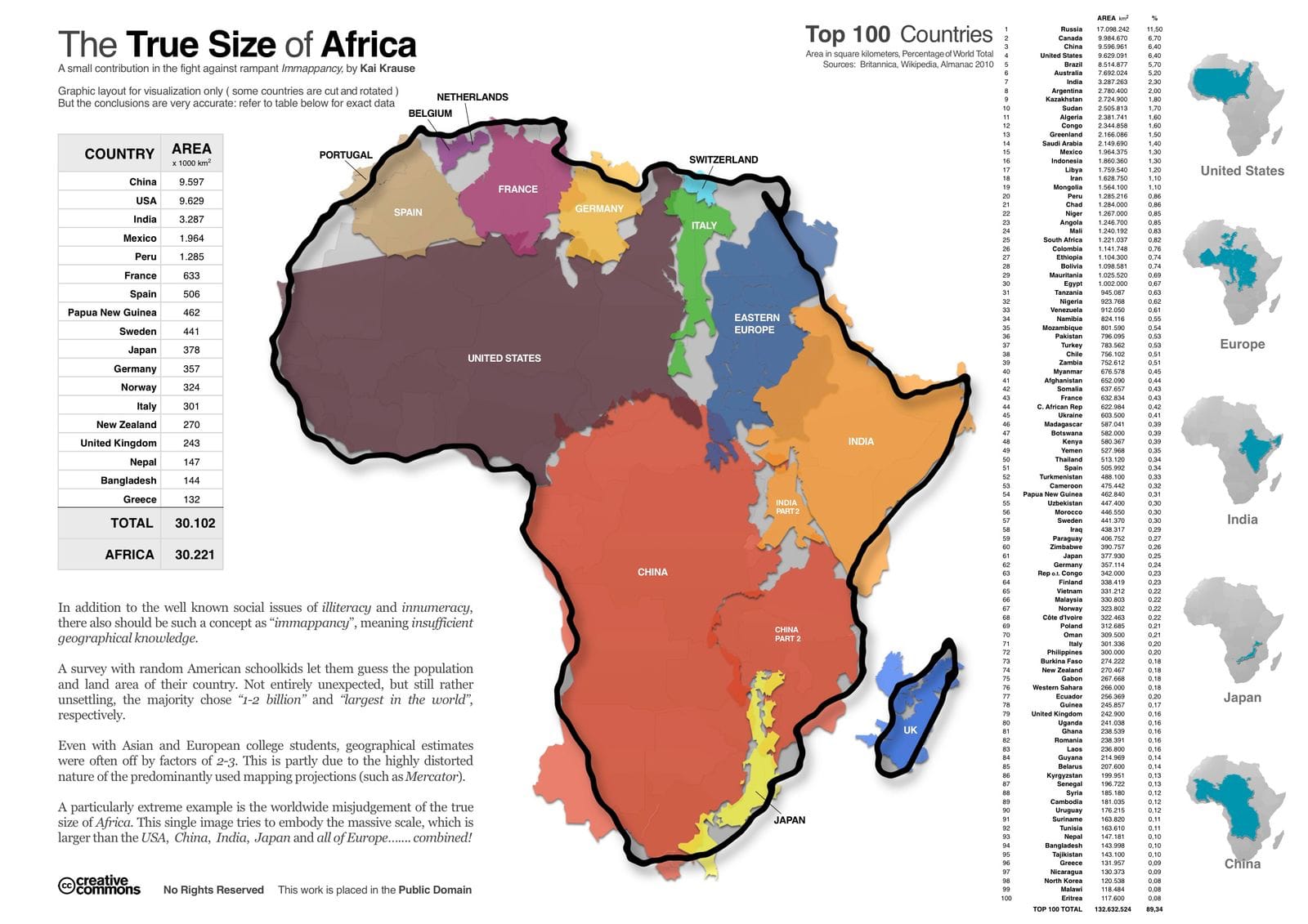
You may have seen this image before. It stirred up quite a controversy on the bird site, involving Twitter Community Notes and the Encyclopedia Britannica.
Rest assured, the image is confirmed to be valid, and the numbers for Russia’s size in Britannica are wrong (the full story in my blog post).
As you will have understood by now, the size of Africa is repeatedly underestimated. And the Mercator projection (and others) has a lot of responsibility in this misconception. Kai Krause’s infographic underscores the immensity of the African continent.
Kai Krause makes this point in his graphic:
“In addition to the well-known social issues of illiteracy and innumeracy, there should also be such a concept as 'immapancy', meaning insufficient geographical knowledge."
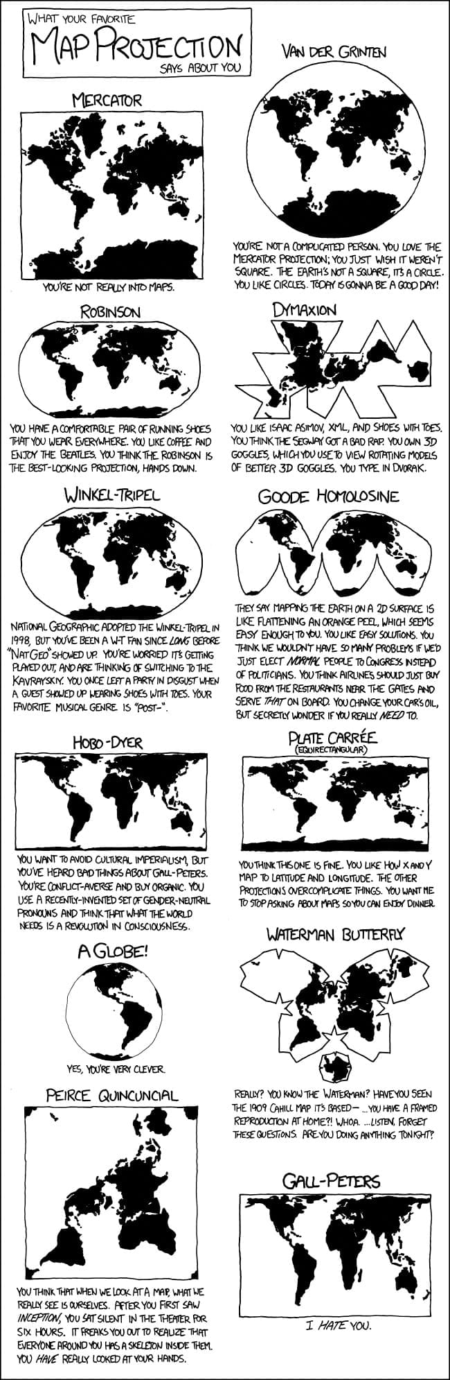
I mentioned there are many map projections. You can always trust XKCD to have covered important topics like maps. In this cartoon your personality is predicted based on which map projection you prefer.
xkcd.com/977/
Image description: learn.axbom.com/xkcd977/
Now, all of this has of course been a setup for you to truly appreciate this scene from The West Wing.
"It’s a lot of fictions really: this idea that Bill Gates is giving away all his money. That’s not true. His personal wealth is nearly doubled during his tenure as a philanthropist.
[…] if you follow the money, almost all charitable gifts go to rich nations like the US, Switzerland, the UK."
@techwontsave.us: Bill Gates is lauded for his philanthropic work, but is he really the “good billionaire”? Tim Schwab joins @parismarx.bsky.social to discuss how the Gates Foundation uses charity to forward similar capitalist business models as Gates promoted at Microsoft. Full ep: techwontsave.us/episode/197_...
@JMarkOckerbloom Nice! And exactly, the consent is given at the time of the event, rather than as a full blanket consent before the browsing session even starts.
I really appreciate the Medications feature of the Health app in iPhone. It reminds me to take my different pills and lets me easily log that I’ve taken them. I’ve been taking a lot over the past six weeks, morning and evening. The app will even allow me to generate a rough visual of what each pill type looks like.
BUT… (there’s always a but isn’t there)
I’m not finding a way to adjust the number of pills so they are different on different days.
When it comes to the blood thinner (Warfarin) the dose is actually adjusted week by week based on my blood coagulation value (PT/INR), and it may be that for the same week I take two pills on the Tuesday and three on the Wednesday. I can only set a value for number of pills that is the same across all days of the week. Ideally I would want to be able to set up the dosage each time the prescription updates.
Unless of course I’ve missed a setting…?
This is not a huge deal because I obviously prepare my physical pill dispenser(s) according to the prescription. But it’d be nice to have the app match reality. Especially for the accuracy of the historical data, which I do enjoy looking at, and may come in useful.
För två år sedan skrev jag en ganska djuplodande analys om varför det är svårt att tolka rapporter som Svenskarna och internet. Det är ligger nära till hands att att älska siffror och tycka att de är självklart sanna när de presenteras i färgglada stapeldiagram.
Jag går in på hur frågorna ställs, hur svarsalternativen påverkar och hur informationen presenteras. Jag kommer också in på urvalet av respondenter.
Kanske är det värt en genomläsning för att påminna sig själv om hur även resultat från enkäter kan vara vanskliga och missvisande.
@kallekn@joakimfors Hypotes: Mastodon/Fediverse har de användare som är minst benägna att ingå i Novus webbpanel, svara på enkäter eller svara på okända nummer. 😅