Skip to content
Notes by Axbom
Per Axbom Bluesky

ALL energy sources are growing continuously. Oil, coal and gas are setting new records. We're not replacing anything… we're just increasing everything.

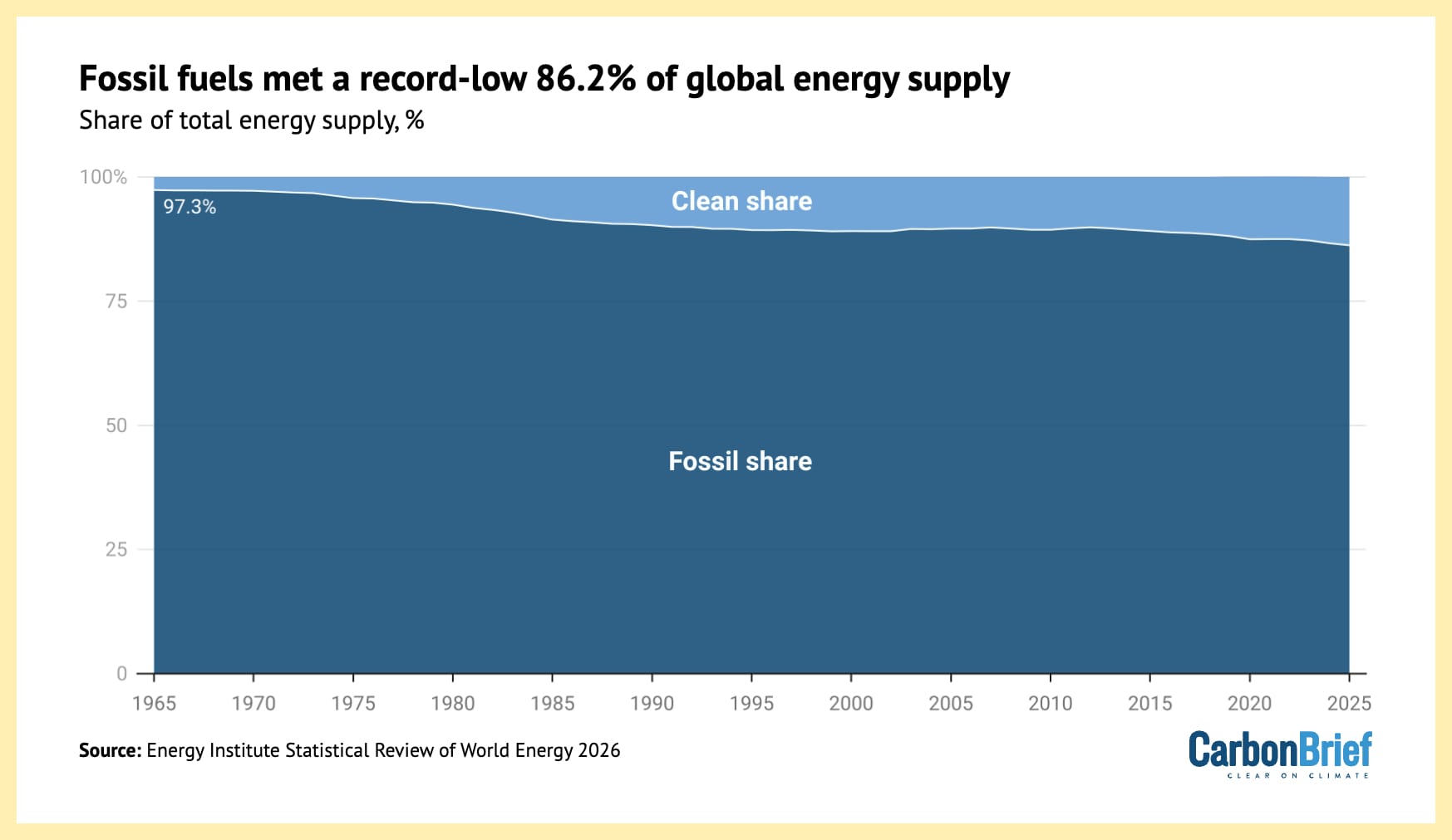
Graph 1 shows how graph 2 is misleading. It makes it look like fossil fuel output is decreasing, even as it is still increasing.
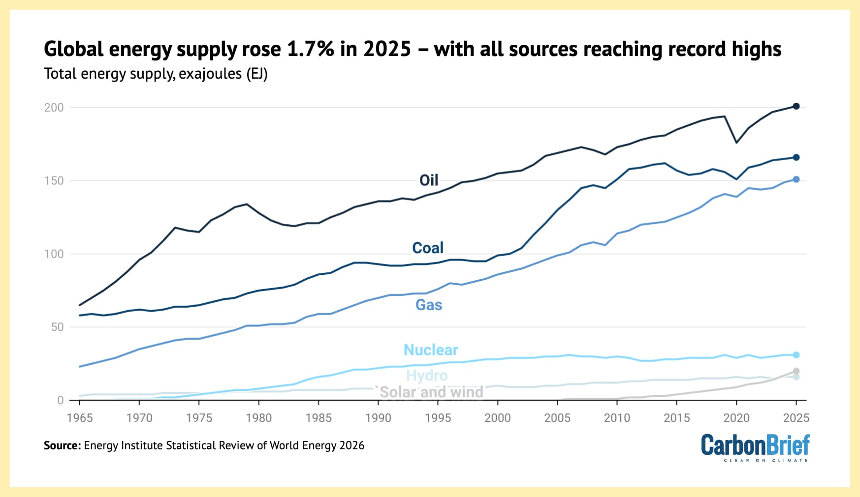
Global energy supplies rose 1.7% in 2025 - with all sources reaching record highs.

A graph from CarbonBrief illustrating total energy supply for all energy sources since 1965 to 2025, showing how the lines for all of them are increasing. The top three are Oil, Coal and Gas (in that order) and then there is a significant gap down to the lines for Nuclear, Hydro and "Solar & Wind".
Fossil fuels met a record-low 86.2% of global energy supply

Graph from CarbonBrief showing how the clean share of energy production is increasing, showing how the fossil share is decreasing, giving the impression that there is less fossil fuel output over time (which is not true).

🔗 Originally posted on Bluesky

11 Aug 2026, 14:09
Share
LinkedIn Bluesky Email
  • Notes by Axbom
  • RSS

© 2026 Notes by Axbom