Skip to content
Notes by Axbom
Per Axbom Bluesky

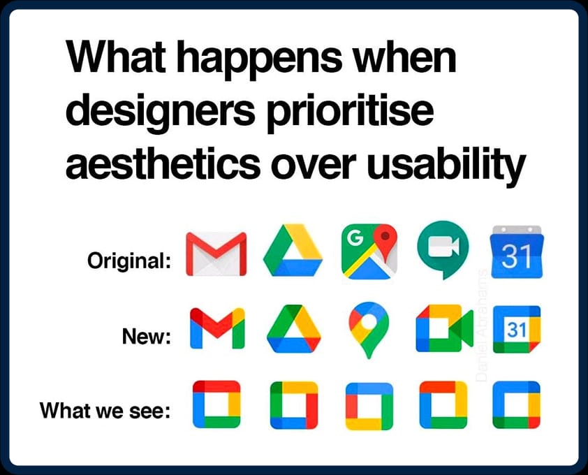
I mean it’s not wrong. #UX

A meme with the title "What happens when designers prioritise aesthetics over usability”.

Below are three rows of icons representing the Google services Gmail, Drive, Maps, Video and Calendar.

The first row is labeled “Original” and shows what the icons used to look like. Each icon was quite unique, with its own shape and color.

The second row is labeled “New” and shows the current icons that have purposely been designed to more closely match each other. All icons contain the same four colors, with all colors contained in rectangular figures that are stitched together to form the shape of each icon.

The third row is labeled “What we see” and has all the icons looking like rounded squares where each side is a different-colored rectangle, each icon only differing from the other by which color is used on each side.

🔗 Originally posted on Bluesky

24 Feb 2025, 20:23
Share
LinkedIn Bluesky Email
  • Notes by Axbom
  • RSS

© 2026 Notes by Axbom